Metrolink
The Challenge
Metrolink needed to reintroduce itself to Southern California with a clear and compelling reason to ride. With a new simplified fare structure in place, the challenge was not just communicating lower prices, but reshaping how people perceive public rail altogether. The goal: increase ridership among both current and new audiences, reduce confusion around ticketing, and position Metrolink as a modern, accessible, and environmentally conscious choice for everyday travel and weekend exploration. We were tasked with building a campaign that could educate, inspire, and shift behaviors, all while supporting long-term brand equity.
Metrolink needed to reintroduce itself to Southern California with a clear and compelling reason to ride. With a new simplified fare structure in place, the challenge was not just communicating lower prices, but reshaping how people perceive public rail altogether. The goal: increase ridership among both current and new audiences, reduce confusion around ticketing, and position Metrolink as a modern, accessible, and environmentally conscious choice for everyday travel and weekend exploration. We were tasked with building a campaign that could educate, inspire, and shift behaviors, all while supporting long-term brand equity.
Project
Creative Campaign
Role
Creative Director
The Approach
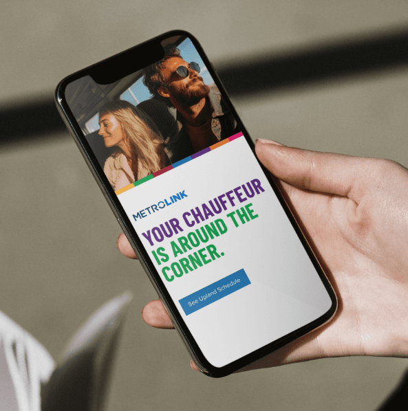
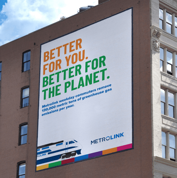
Visually, the campaign used bold, high-contrast typography on clean white backgrounds to reflect simplicity and confidence. A flowing color ribbon, drawn from the Metrolink system map, became a graphic throughline symbolizing connection and movement. Hero photography showcased iconic Southern California destinations accessible by train, from beaches and breweries to concerts and cultural landmarks. Media spanned digital, social, out-of-home, TV, and influencer activations, ensuring reach across all key audience segments from young professionals and students to eco-conscious commuters and local families. Everything pointed back to a singular idea: riding Metrolink isn’t just smart, it’s a gateway to going everywhere with ease and clarity.
The Approach
Visually, the campaign used bold, high-contrast typography on clean white backgrounds to reflect simplicity and confidence. A flowing color ribbon, drawn from the Metrolink system map, became a graphic throughline symbolizing connection and movement. Hero photography showcased iconic Southern California destinations accessible by train, from beaches and breweries to concerts and cultural landmarks. Media spanned digital, social, out-of-home, TV, and influencer activations, ensuring reach across all key audience segments from young professionals and students to eco-conscious commuters and local families. Everything pointed back to a singular idea: riding Metrolink isn’t just smart, it’s a gateway to going everywhere with ease and clarity.
The Strategy
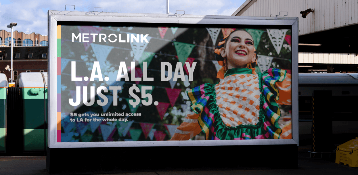
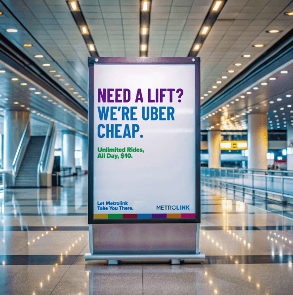
We developed a layered creative platform that could speak to both the head and the heart. At its core was the new branded fare system, The Freedom Fare, which simplified pricing into an easy-to-understand offer: $5 for LA, $10 on weekends, $15 on weekdays, and flexible options for students, commuters, and families. This became the anchor of our storytelling. From there, we introduced two complementary creative executions. “Let Metrolink Take You There” served as the practical platform, highlighting clarity, cost savings, convenience, and environmental benefits. “Want to Go?” brought emotional resonance by showcasing real destinations and scenarios that made the fare structure tangible and exciting. Together, the campaign united utility and inspiration under one cohesive brand voice.
We developed a layered creative platform that could speak to both the head and the heart. At its core was the new branded fare system, The Freedom Fare, which simplified pricing into an easy-to-understand offer: $5 for LA, $10 on weekends, $15 on weekdays, and flexible options for students, commuters, and families. This became the anchor of our storytelling. From there, we introduced two complementary creative executions. “Let Metrolink Take You There” served as the practical platform, highlighting clarity, cost savings, convenience, and environmental benefits. “Want to Go?” brought emotional resonance by showcasing real destinations and scenarios that made the fare structure tangible and exciting. Together, the campaign united utility and inspiration under one cohesive brand voice.